+Canvas, LA Art Gallery Audio Tour App
Art Director | UX/UI Designer
+Canvas is an art gallery audio tour app created to give you more information about the art and artist in smaller galleries were usually missing information about the art/artist is not provided.
THE PROBLEM
We noticed a gap of missing information was provided at smaller galleries about the art pieces and the artist. Most big museums like LACMA or the Getty Center provide an audio tour in the museums but none at smaller independent galleries. Our goal is to help anybody and everybody learn more about the art/artist.THE GOAL
I conducted interviews and created empathy maps to understand the users I’m designing for and their needs. Primary user groups identified through research were college students and retired adults who wanted to learn more about unknown artist in smaller independent galleries.USER RESEARCH: SUMMARY
These user groups confirmed initial assumptions about the unknown factor of art and the artist, but research also revealed that smaller galleries in general do not tend to give more information. Other user problems included time, interests, or challenges that make it difficult to have users spend time at a smaller gallery for long.USER RESEARCH: PAIN POINTS
MONEY
The cost of galleries can be an issue with students that usually does not have a steady income.
TIME
Some galleries only operate at specific times.
ACCESSIBILITY
Not all audio tours are equipped with assisitive technologies.
PERSONA
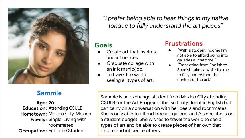
Problem Statement: Sammie is an exchange student from Mexico City who needs to learn more about art and the artist because she is still exploring the art world.
USER JOURNEY MAP: SAMMIE
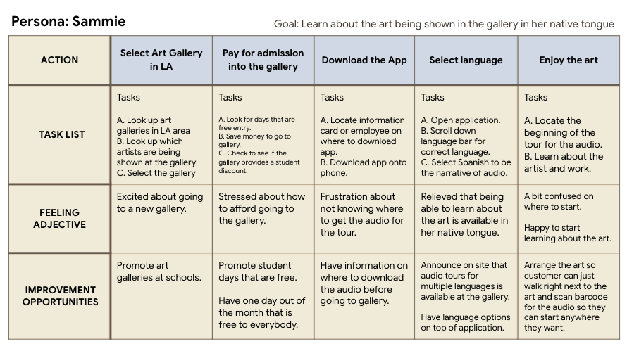
Mapping Sammie's user journey revealed how helpful it would be for users to have access to a dedicated art gallery audio tour app.
Click on the image to see Sammie's User Journey Map.
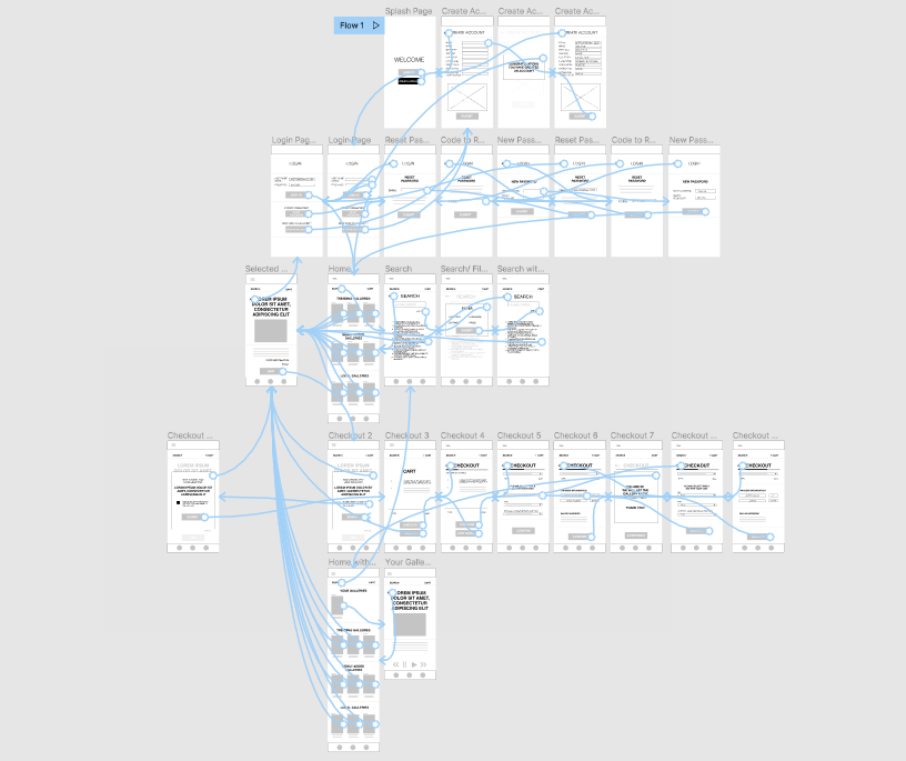
PAPER WIREFRAMES
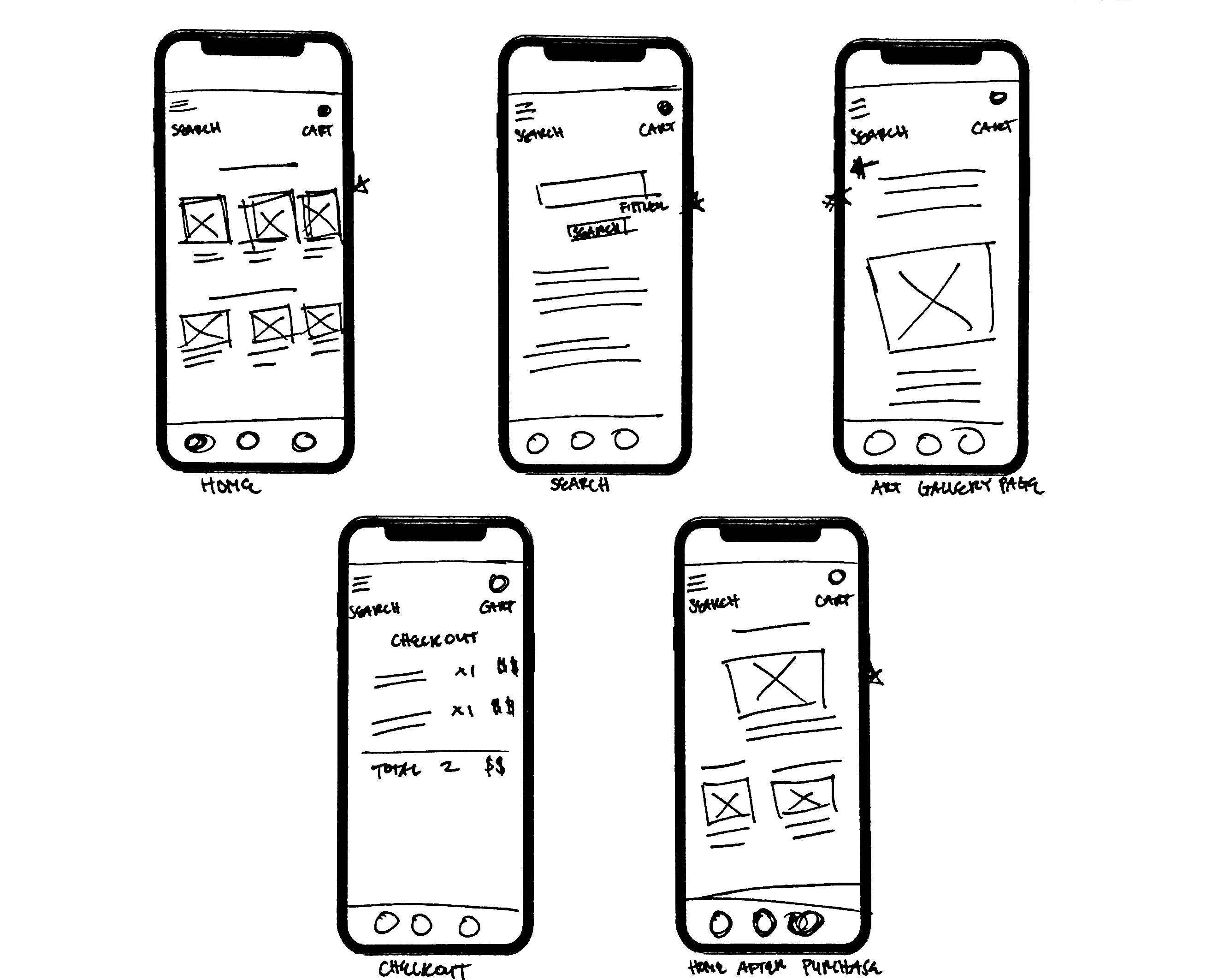
Taking the time to draft iterations of each screen of the app on paper ensured that the elements that made it to digital wireframes would be well-suited to address user pain points. Also highlighting certain aspects of what was needed to be put in the wireframes.
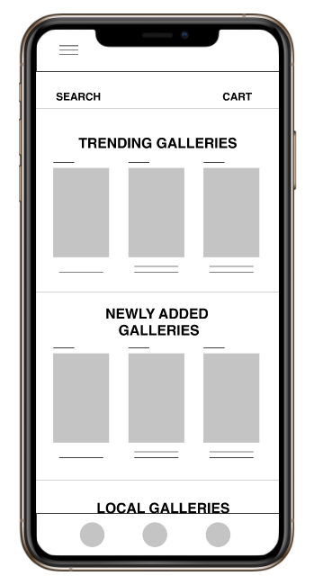
DIGTAL WIREFRAMES
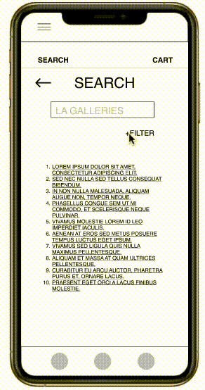
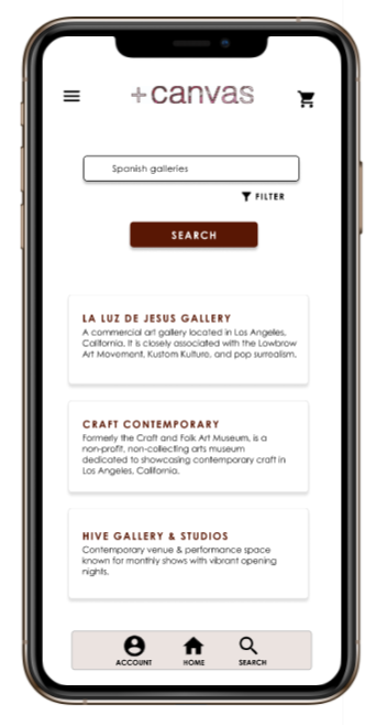
While designing the search page, I made sure to add a filter button to make the user experience tailored to the user while they search for a gallery.
Another key factor to make the user experience more easy was to add an option for the user to buy an E-ticket admission while they also order an audtio tour for the gallery.
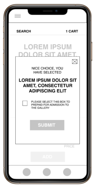
LO-FI MOCKUP PROTOTYPE
Using the completed set of digital wireframes, I created a low-fidelity prototype. The primary user flow I connected was selecting a gallery and the checkout process, so the prototype could be used in a usability study.
View the +Canvas App by clicking on the lo-fi prototype image.
USABILITY STUDY: FINDINGS
I conducted two rounds of usability studies. Findings from the first study helped guide the designs from wiregrames to mockups. The second study used a high-fidelity prototype and revealed what aspects of the mockups needed refining.
ROUND 1 FINDINGS
- Market for LA gallery tour app.
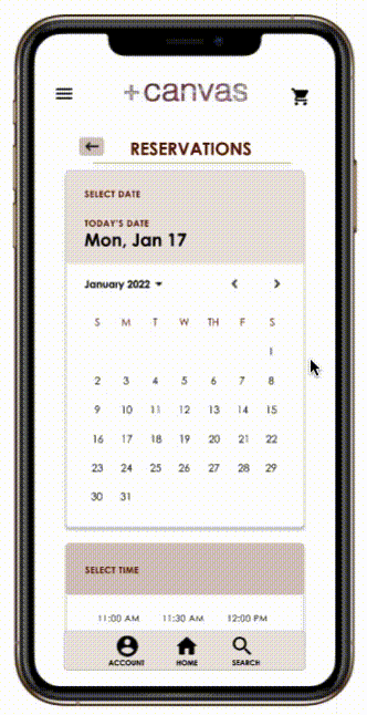
- Calendar view for date picker.
- Summary of each gallery on search page.
ROUND 2 FINDINGS
- The back button gets muddled with the app design.
- Wording on the popup text screens are confusing.
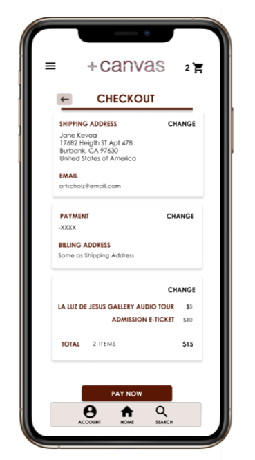
- Users wants to know price of admission to the gallery before proceeding to checkout.
MOCKUPS
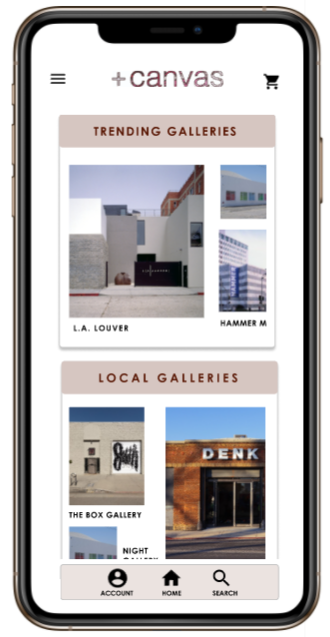
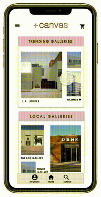
Going from Lo-Fi to Hi-Fi, some aspects of the design were changed and added to make the use of space and functionality of the app more appealing to the eye. In this example, the Home screen is now in containers and have different ratio aspects to the images.
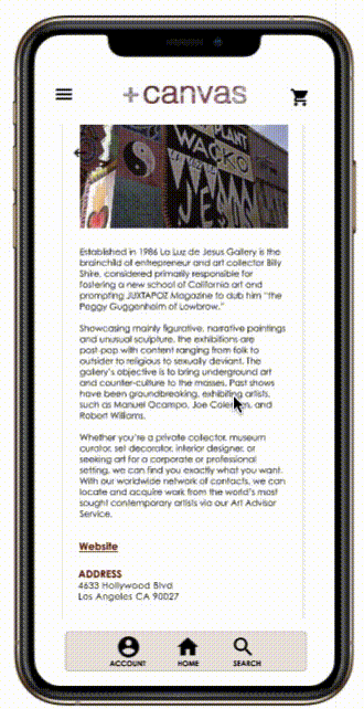
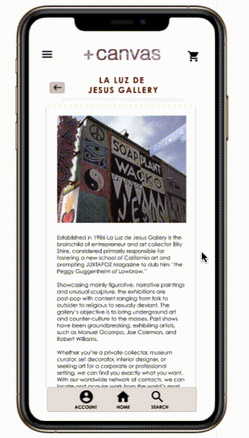
During the second Usability study, users found the back button blended in with text while scrolling through the gallery page. Instead, I decided to move the header and added a background color to the back button out of the scrollable field and position the elements on top of the body.
KEY MOCKUPS
HI-FI MOCKUP
The final high-fidelity prototype presented cleaner flow with a few changes to make the user experience constant throughout the app.
View the final +Canvas App by clicking on the hi-fi prototype image.
ACCESSIBILITY CONSIDERATIONS
1
Let the user pick their preferred language used for audio.
2
Provide access to users who are vision impaired through adding alt text to image for screen readers.
3
Used icons with text to help make navigation easier.
TAKEAWAYS
IMPACT:
The app fills a void in the art community for Audio Tours, while most audio tours are only found in museums like LACMA or the Getty, the app caters to the smaller galleries.
One quote from peer feedback:
"The app will definitely be useful for me since I’m a college student still learning the many technique and different fields of art."
WHAT I LEARNED:
While designing the +Canvas app, I learned what users really want in this particular app. Usability studies and peer feedback influenced each iteration of the app’s designs.
NEXT STEPS
1
Conduct another round of usability studies to validate whether the pain points users experienced have been effectively addressed.
2
Conduct more user research to determine any new areas of need.
3
Make small changes to the layout so steps are easy to understand.
LET’S CONNECT
Thank you for looking at my case study of +Canvas App. To see this case study as a presenation deck, please click here. If you’d like to see more or get in touch, my contact information is provided below.
Connect with me on LinkedIn