MobileAid+ App & Responsive Web
Art Director | UX/UI Designer
MobileAid+ is a California-based organization focused on First Aid on the Go. The organization needs a tool that will help people learn and perform life saving acts of first aid. MobileAid+ primary target of users is anyone outside the medical community, the blue collar workers etc.
THE PROBLEM
A study from the American Heart Association from 2018 found only 45% of the American workforce is trained in First Aid. In another study from St John Ambulance (UK) revealed that two out of three people would not feel confident to save a life in an emergency and a quarter of the population would stand by and do nothing. This is a huge problem, hence MobileAid+ comes in.
THE GOAL
Design an app that will improve education on the topic of first aid and help people have the basics of first aid on the go & at their fingertips.
USER RESEARCH: SUMMARY
I used Research data found on respected Medical websites to develop interview questions, which were then used to conduct user interviews. Most interview participants had no clue where to start with first aid, while 30% had a significant, friend or family member in the medical field to help. The feedback received through research made it very clear that users would benefit from having an app on their devices about the basics of first aid.
PERSONAS
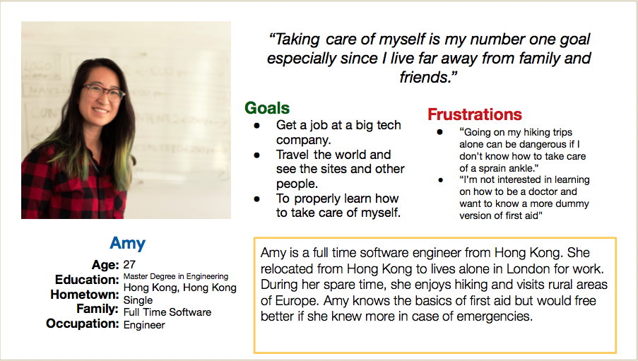
Problem Statement: Amy is a full time software engineewho needs to learn the basics of first aid because she never was taught or learned first aid.
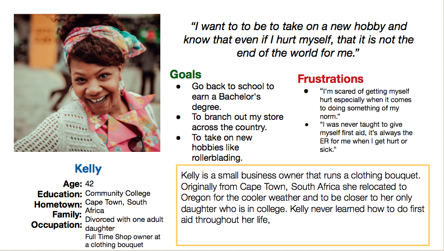
Problem Statement: Kelly is a small business owner who needs a safety net for first aid on the go because she is afraid of getting hurt.
COMPETITIVE AUDIT
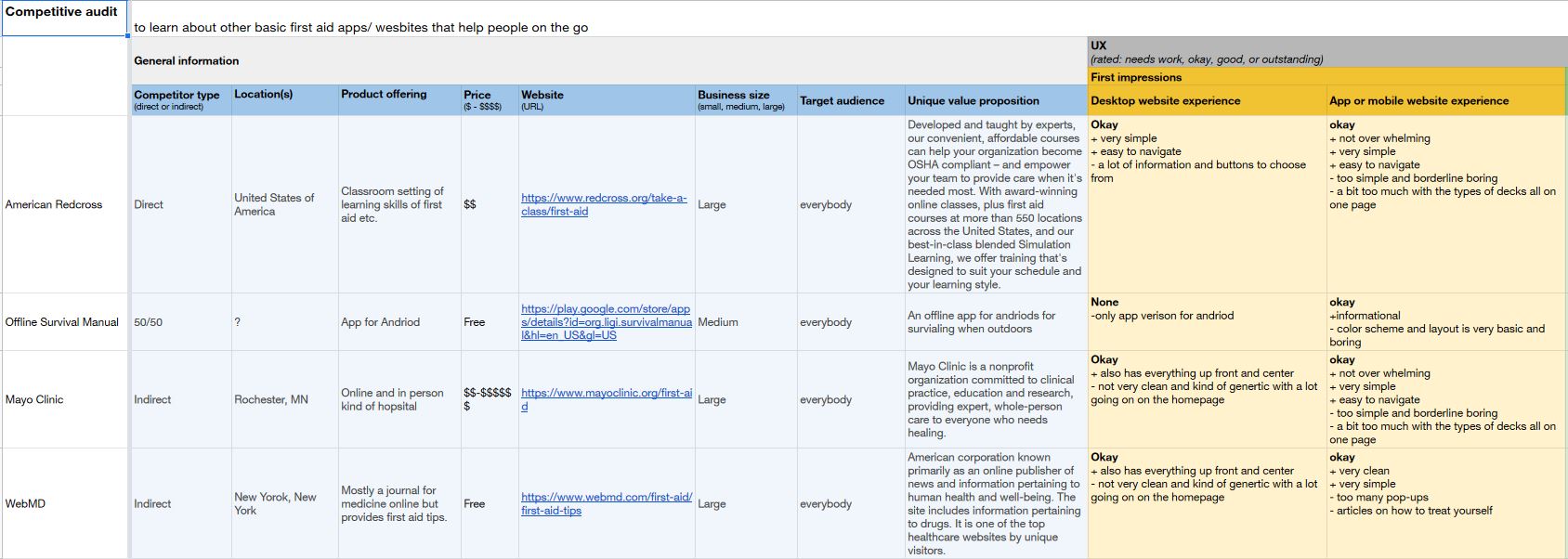
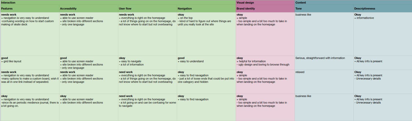
An audit of a few competitor’s products provided gaps and opportunities to address with the MobileAid+ app.
Click here for the document of the competitive audit.
IDEATION
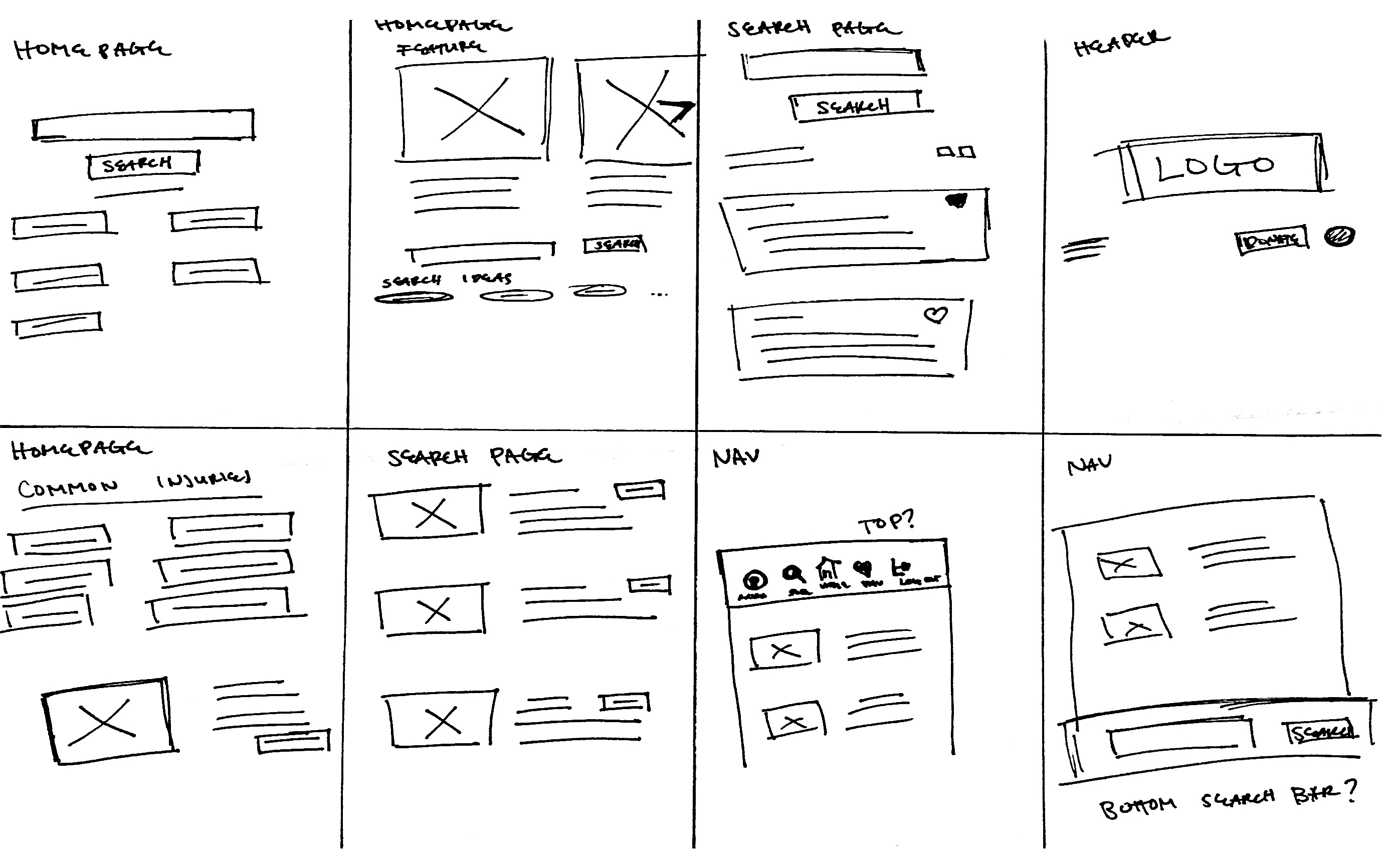
I did a quick ideation exercise to come up with ideas for how to address gaps identified in the competitive audit. My focus was specifically on the layout of and top frequent categories of first aid.
DIGTAL WIREFRAMES
After ideating and drafting some paper wireframes, I created the initial designs for the MobileAid+ app. These designs focused on delivering personalized guidance to users to help users identify their injury.
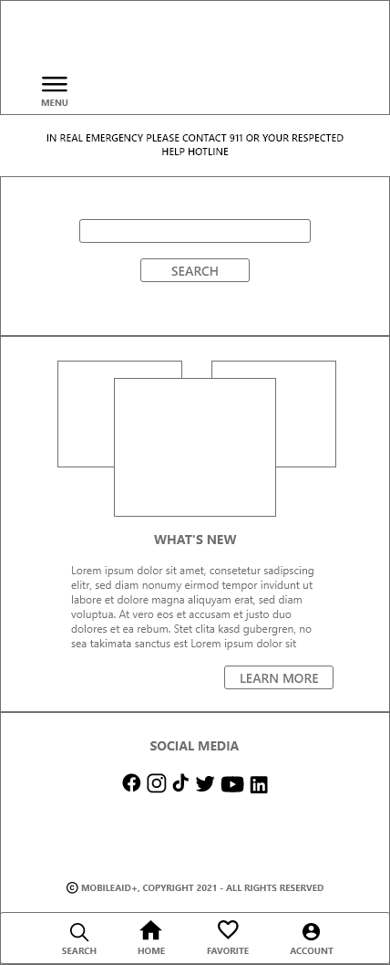 |
The initial homepage of the mobile app. |
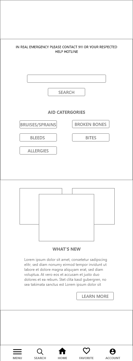 |
However it was changed to add categories of injuries. |
LO-FIDELITY PROTOTYPE
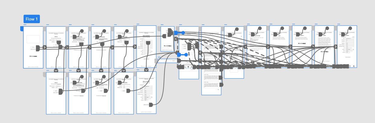
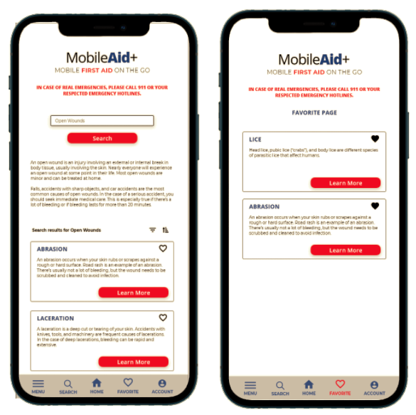
To prepare for usability testing, I created a low-fidelity prototype that connected the user flow of viewing an injury category and having the user favorite the injury.
View the MobileAid+ low-fidelity prototype.
USABILITY STUDY: PARAMETERS
STUDY TYPE: |
Unmoderated usability study |
|---|---|
LOCATION: |
Worldwide, remote |
PARTICIPANTS: |
5 participants |
LENGTH: |
15 - 30 minutes |
USABILITY STUDY: FINDINGS
After I conducted my first round of usability studies, I found that users wanted more accessibility functions.
1. BACK BUTTON
Users wanted a back button to go to the previous page because it would help make the app more accessible for users.
2. MENU LOCATION
Users wanted the menu button in the navigation bar on the bottom.
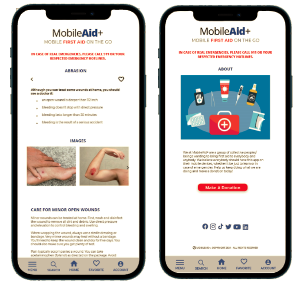
3. PICTURES
Users wanted pictures to go along with instructions to treat themselves on the information page.
MOCKUPS
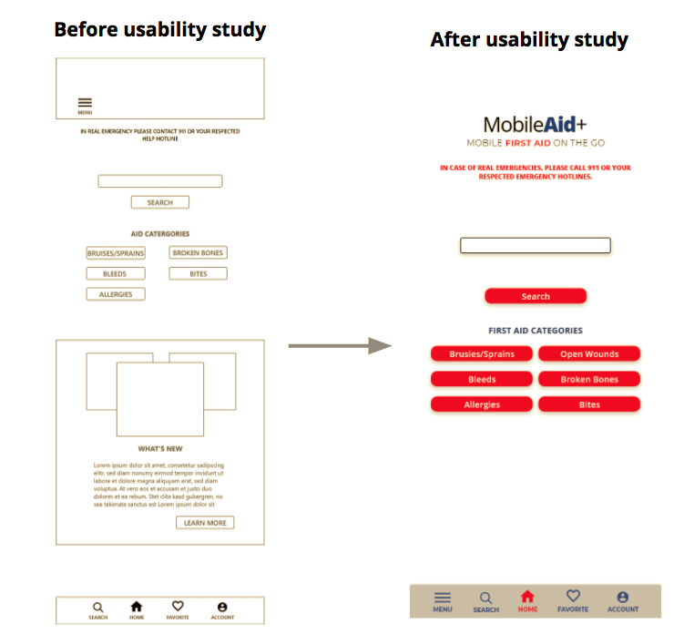
Based on the insights from the usability study, I applied design changes like getting rid of the “what’s new” section of the app on the homepage and making it solely for a search page.
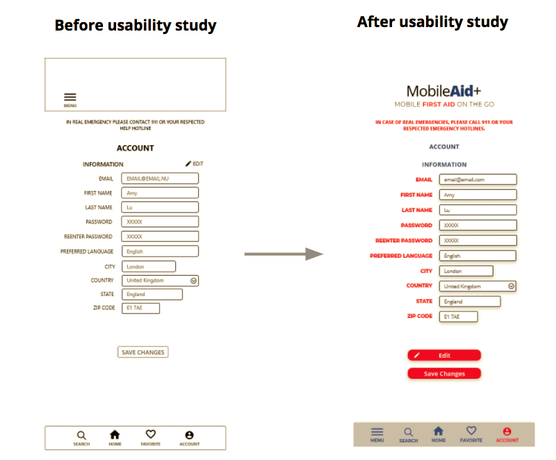
Additional design changes included adding the menu button to the bottom with the navigation bar.
KEY MOCKUPS
HI-FI MOCKUP
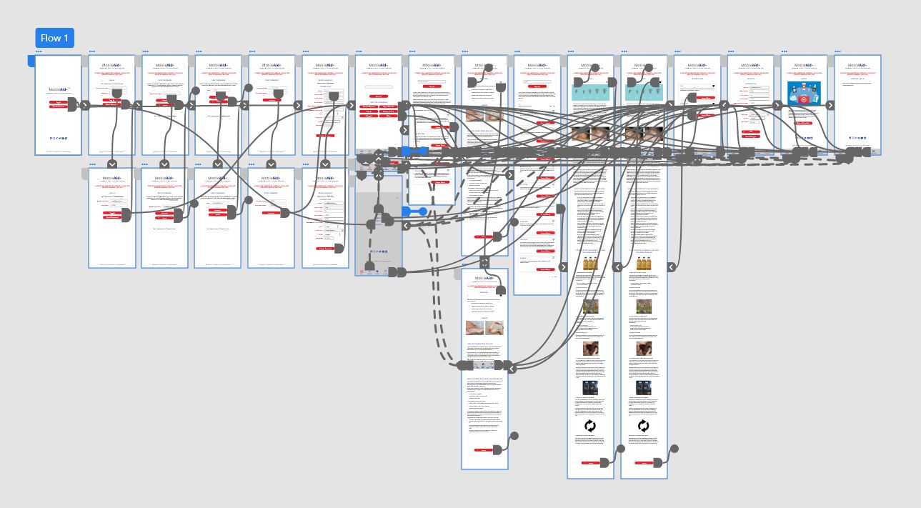
The high-fidelity prototype followed the same user flow as the low-fidelity prototype, including design changes made after the usability study.
View the MobileAid+ App
high-fidelity prototype
ACCESSIBILITY CONSIDERATIONS
1
Clear labels for interactive elements that can be read by screen readers.
2
Initial focus of the home screen on personalized recommendations help define the primary task or action for the user.
3
I used headings with different sized text for clear visual hierarchy.
SITEMAP
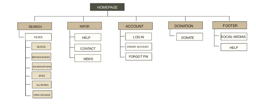
With the app designs completed, I started work on designing the responsive website. I used the MobileAid+ sitemap to guide the organizational structure of each screen’s design to ensure a cohesive and consistent experience across devices. Also an added feature for the web design I added articles about relatable topics and a donation page.
RESPONSIVE DESIGNS
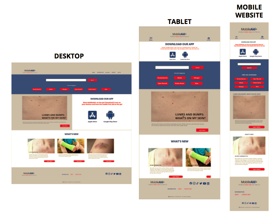
The designs for screen size variation included mobile, tablet, and desktop. I optimized the designs to fit specific user needs of each device and screen size.
View the final product for MobileAid+ Mobile website.
TAKEAWAYS
IMPACT:
Users shared that the app made learning about the basics of first aid very easy and with the feature of bookmarking an injury or medical was an added plus.
One quote from a user's feeback:
“A must have for everybody like me, tbh. I don't know any first aid stuff and relay on the internet or going to to ER most of the time."
WHAT I LEARNED:
I learned that even though learning first aid is a priority for everybody, majority of people do know the basics of it. Having an app or website that will help people that are in a tight spot will help or even save someone's life. Also the process and aligning with specific user needs helped me come up with solutions that were both feasible and useful.
NEXT STEPS
1
Conduct another round of usability studies to validate whether the pain points users experienced have been effectively addressed.
2
Add more educational resources for users to learn more about first aid.
3
Identify any additional areas of need and ideate on new features.
LET’S CONNECT
Thank you for looking at my case study of MobileAid+ App and Responsive Web Design. To see this case study in a presentation deck, please click here. If you’d like to see more or get in touch, my contact information is provided below.
Connect with me on LinkedIn