Spirited Skateboards, Responsive Web Design
Art Director | UX/UI Designer
Spirited Skateboards is a custom design website allowing users to create a custom deck from start to finish.
THE PROBLEM
While I noticed there were other custom design skateboard sites on the internet, many of them were confusing to navigate through with so many options to choose from and no clear way to begin customizing a deck.THE GOAL
The goal was to simplify the process of customizing a skateboard without feeling like you are bombard with so many choices at once.USER RESEARCH: SUMMARY
I conducted interviews and created empathy maps to understand the users I’m designing for and their needs. Primary user groups identified through research were teenagers, young adults & people in their 30’s learning a new hobby.These user groups confirmed initial assumptions about how vast the market is for custom design skateboards but finding a reputable one was difficult to locate since they not only offer custom design boards. Other user problems included time, cost, or feeling overwhelmed when visiting other custom design skateboard websites.
USER RESEARCH: PAIN POINTS
EXPERIENCE
Online shopping websites don’t provide an engaging browsing experience, most users feel the company just cares about the income.
MONEY
Money was a concern for teenagers and young adults since they usually are in school and not working a full time job
NAVIGATION
Shopping website designs are often busy, which results in confusing navigation
PERSONA
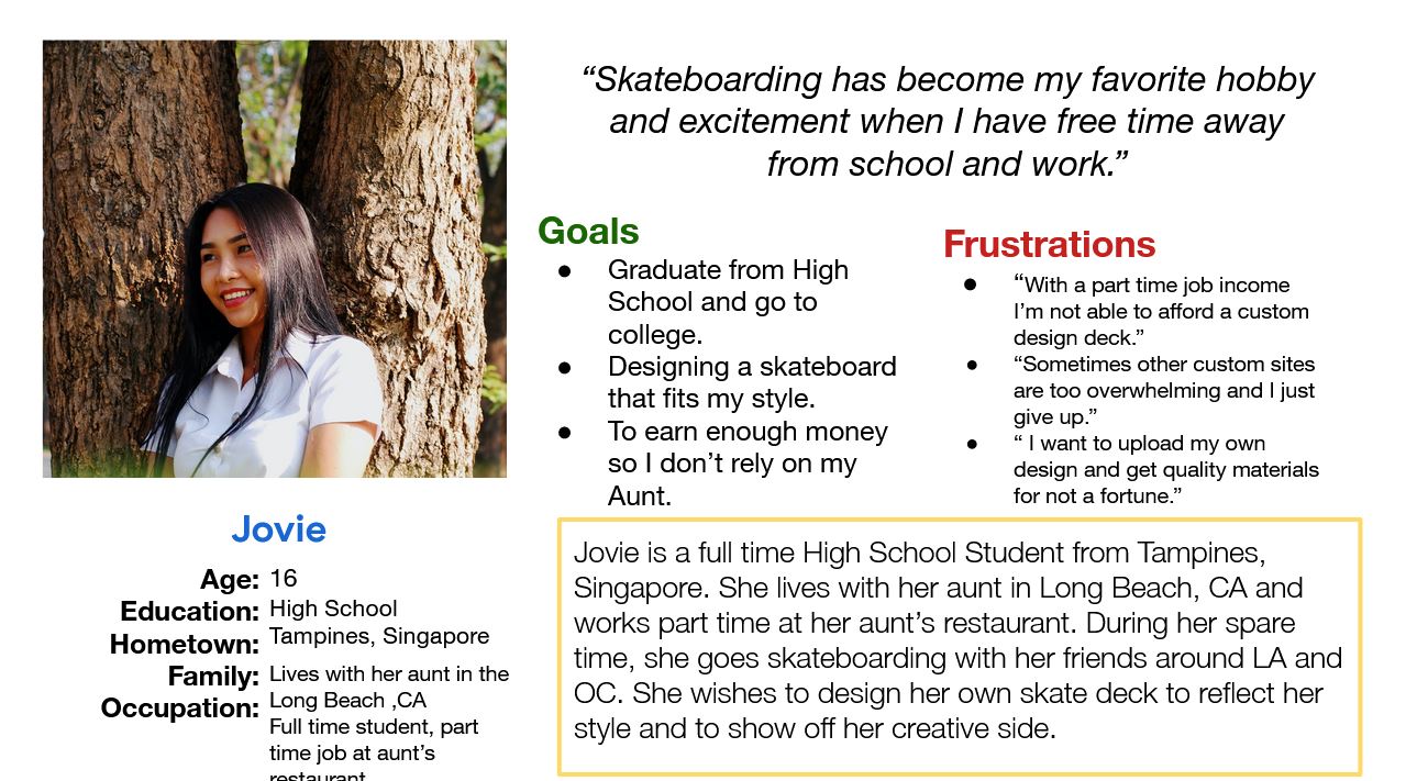
Problem Statement: Jovie is a full time High School student who needs to save enough money because she wants to design her own custom design skateboard.
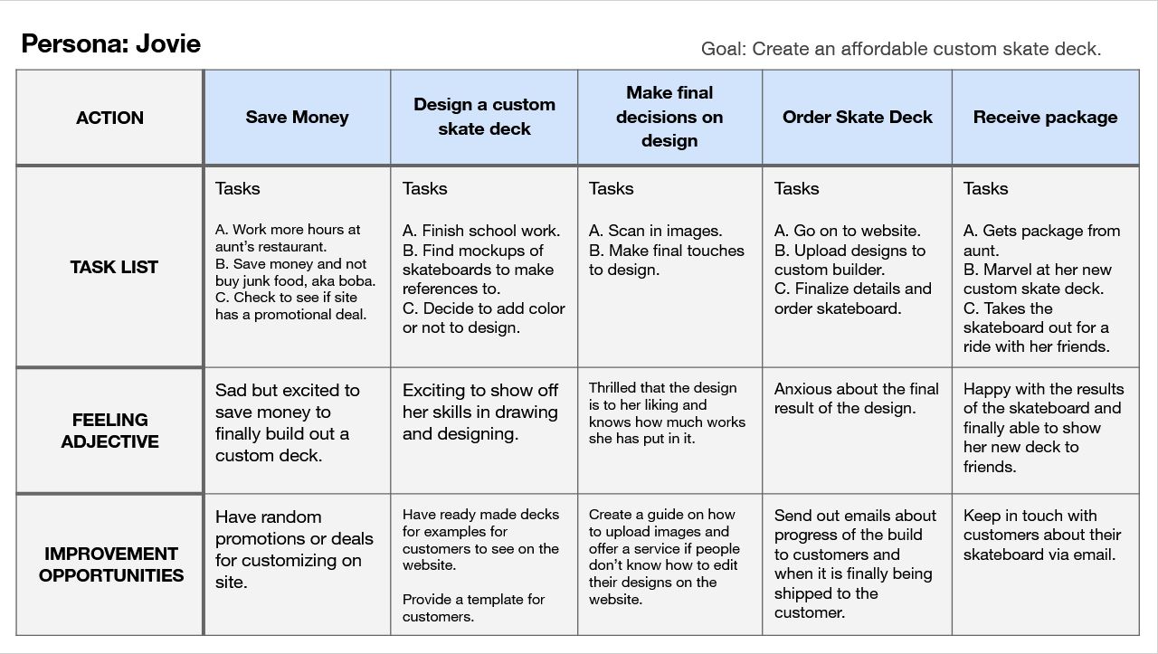
USER JOURNEY MAP: JOVIE
Mapping Jovie’s user journey revealed how how a real full time high school student spent most of their day along with their emotions.
Click on the image to see Jovie's User Journey Map.
SITEMAP
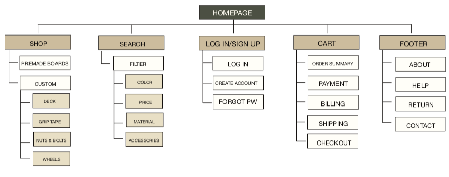
Difficulty with website navigation was a primary pain point for users, so I used that knowledge to create a sitemap.
My goal here was to make strategic information architecture decisions that would improve overall website navigation. The structure I chose was designed to make things simple and easy.
PAPER WIREFRAMES
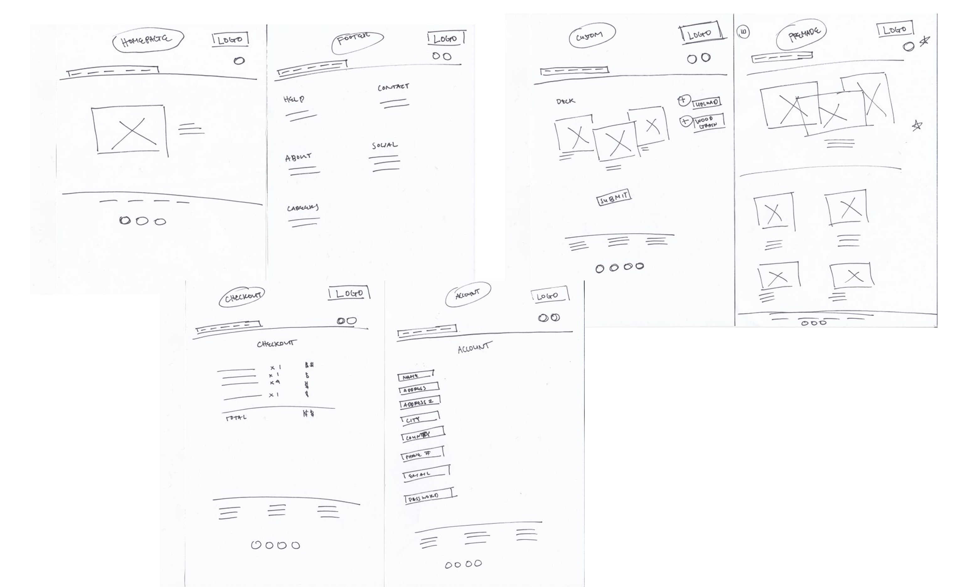
Taking the time to draft iterations of each screen of the app on paper ensured that the elements that made it to digital wireframes would be well-suited to address user pain points. Also highlighting certain aspects of what was needed to be put in the wireframes.
PAPER WIREFRAMES SCREEN SIZE VARIATIONS
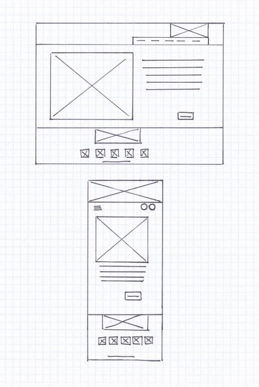
Because Spirited Skateboards’ customers access the site on a variety of different devices, I started to work on designs for additional screen sizes to make sure the site would be fully responsive.
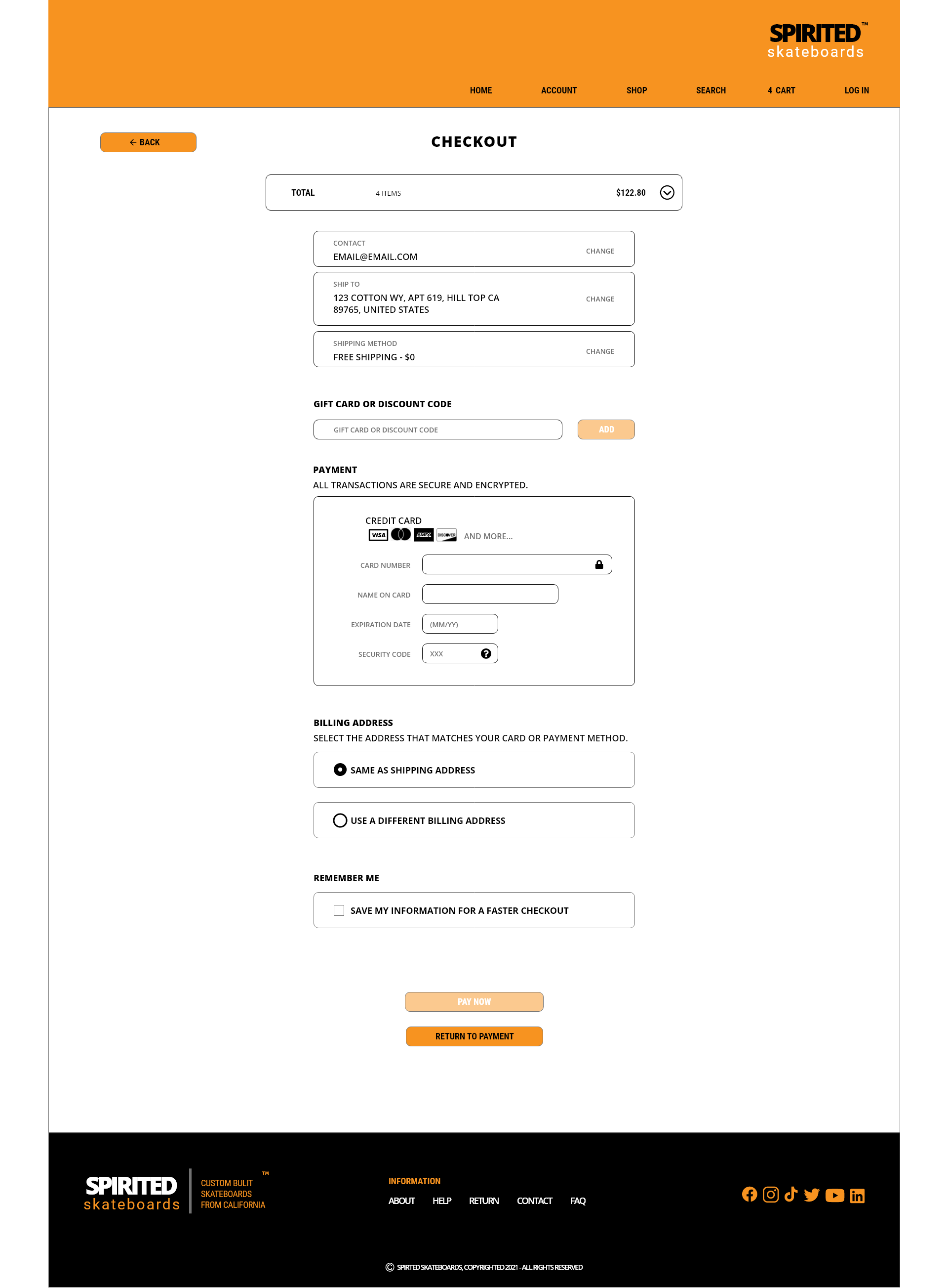
DIGTAL WIREFRAMES
Another key factor to make the user experience more enjoyable was to add a indicator of what the user has added so far during their custom built journey. Since items were not added to cart until after the user completed the custom journey, users were left in the dark of what was added- a simple fix a what you have chosen so far bar.
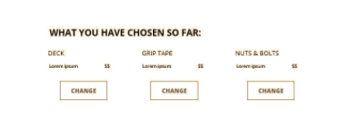
This indicator was added to the bottom of each step of the custom built journey so users knew what they had added so far.
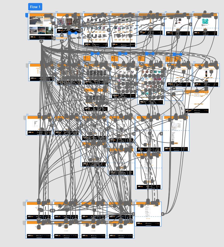
LO-FIDELITY PROTOTYPE
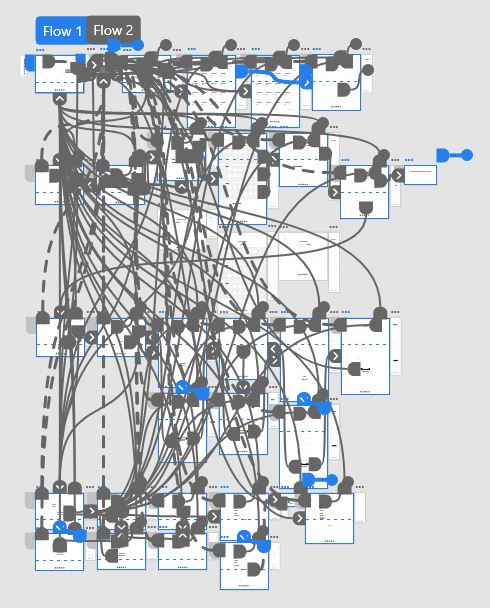
Using the completed set of digital wireframes, I created a low-fidelity prototype. The primary user flow I connected was building a custom skateboard and the checkout process.
View the Spirited Skateboard Website:
low-fidelity prototype.
USABILITY STUDY: PARAMETERS
STUDY TYPE: |
Unmoderated usability study |
|---|---|
LOCATION: |
United States, remote |
PARTICIPANTS: |
6 participants |
LENGTH: |
15 - 30 minutes |
USABILITY STUDY: FINDINGS
I conducted two rounds of usability studies. Findings from the first study helped guide the designs from wireframes to mockups. The second study used a high-fidelity prototype and revealed what aspects of the mockups needed refining.
ROUND 1 FINDINGS
- Users wanted to know what they added so far to the custom built journey for the skateboard.
- The navigation bar pull out for the website made it feel more like a mobile website.
- More information about the products.
ROUND 2 FINDINGS
- The skip step button was in odd places and inconsistent.
- Wording on popup custom built journey was unrelated.
- Users wanted a product information page with more information about the product.
MOCKUPS
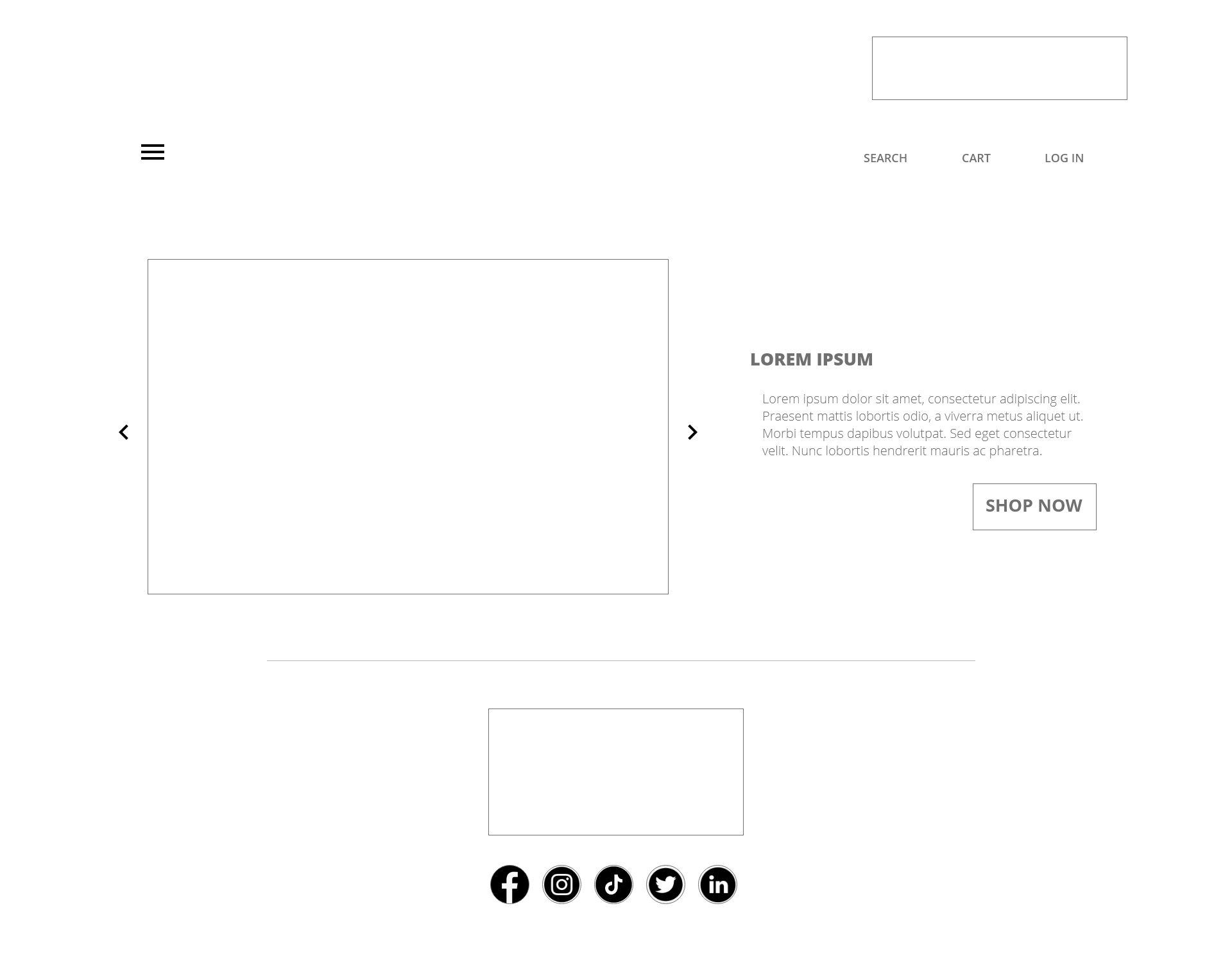
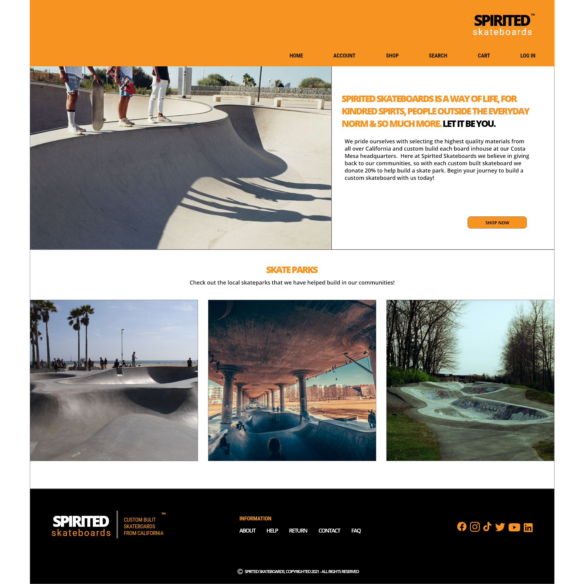
Going from Lo-Fi to Hi-Fi, some aspects of the design were changed and added to make the use of space and functionality of the website flow with ease. In this example, the Home page got an added bonus to showcase what the company has done so far by giving back to the community.
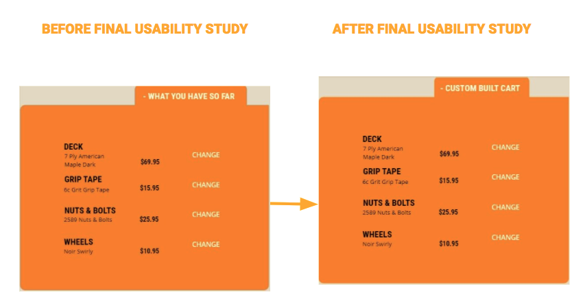
During the second Usability study, users found the wording of the what you have so far found pop up during the custom build of the skateboard confusing and unrelated. A simple fix was to change the wording to related to the customizing of their skateboard.
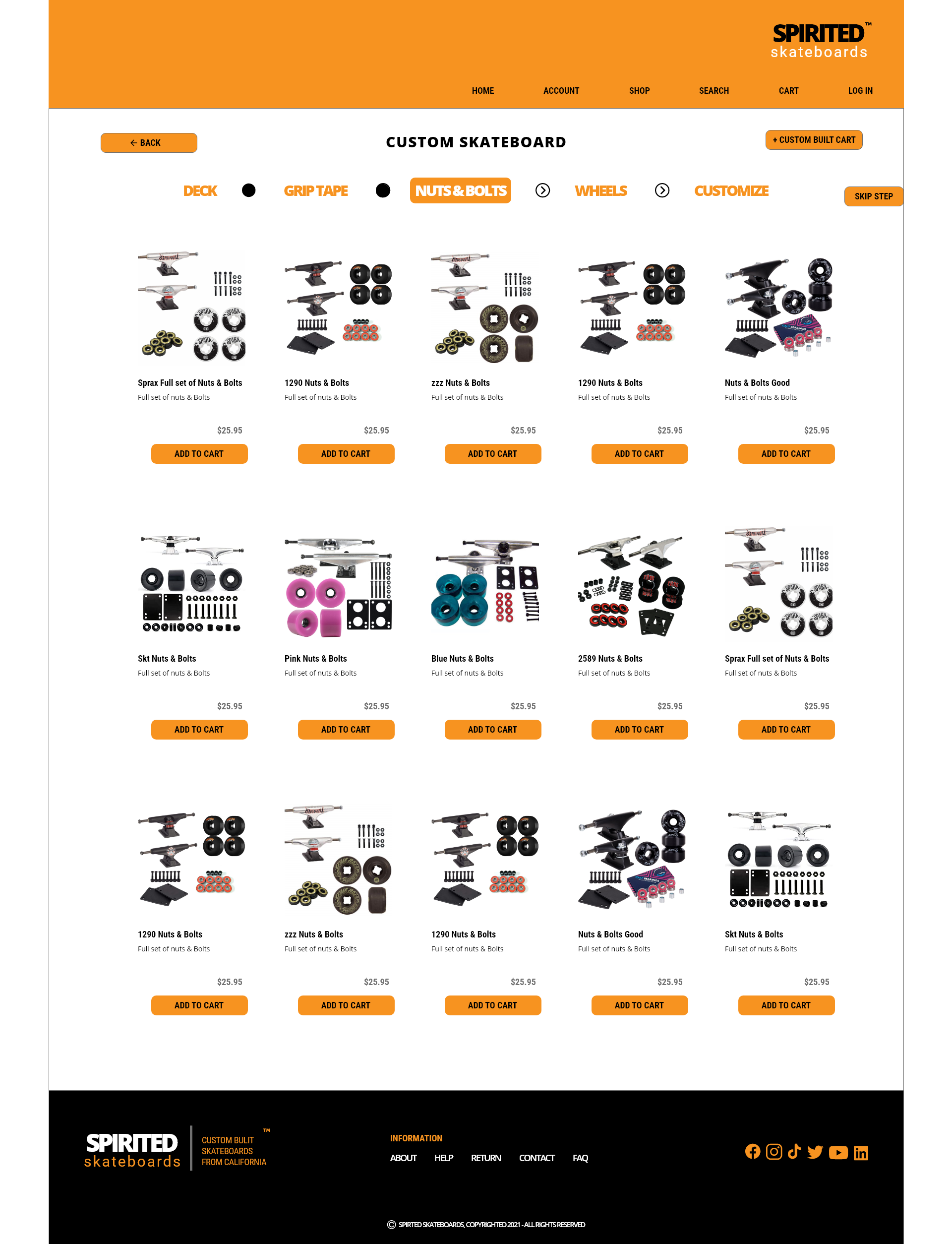
KEY MOCKUPS

HI-FI MOCKUP
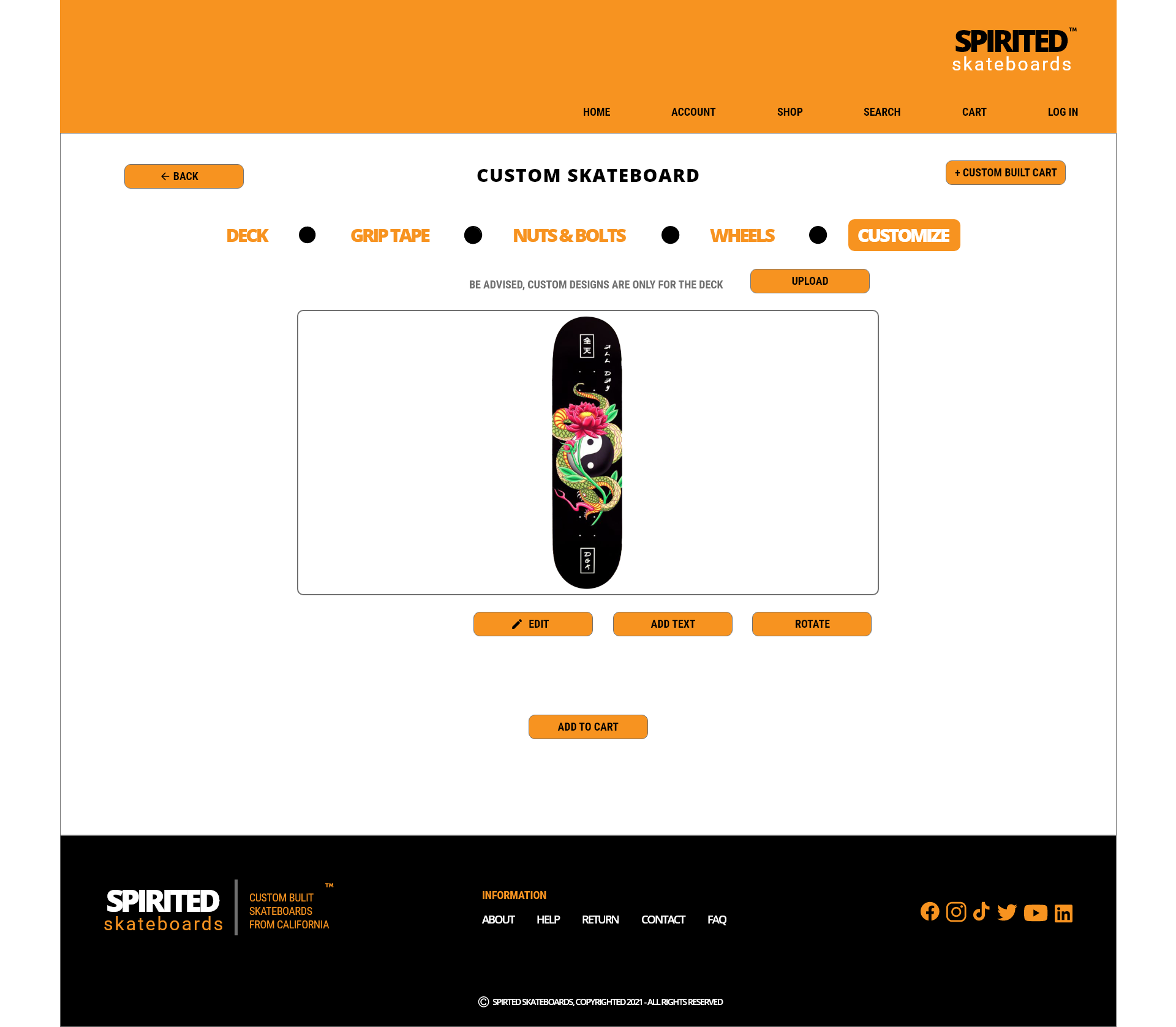
The final high-fidelity prototype presented cleaner flow with a few changes to make the user experience constant throughout the website.
View the Spirited Skateboard Website:
high-fidelity prototype
ACCESSIBILITY CONSIDERATIONS
1
I used headings with different sized text for clear visual hierarchy
2
I used landmarks to help users navigate the site, including users who rely on assistive technologies.
3
I designed the site with alt text available on each page for smooth screen reader access.
TAKEAWAYS
IMPACT:
Our target users shared that the design was intuitive to navigate through, more engaging with the images, and demonstrated a clear visual hierarchy.
WHAT I LEARNED:
I learned imagery and the right placement of key features makes the website navigation more with ease. Also that even a small design change can have a huge impact on the user experience. The most important takeaway for me is to always focus on the real needs of the user when coming up with design ideas and solutions.
NEXT STEPS
1
Conduct another round of usability studies to validate whether the pain points users experienced have been effectively addressed..
2
Conduct follow-up usability testing on the new website.
3
Identify any additional areas of need and ideate on new features.
LET’S CONNECT
Thank you for looking at my case study of Spirited Skateboards Responsive Web Design. To see this case study in a presentation deck, please click here. If you’d like to see more or get in touch, my contact information is provided below.
Connect with me on LinkedIn